Tätä opasta ei ole vielä omalla kielelläsi, joten tässä se on englanniksi.
Lyhyesti
- A gradient's angle decides where its light seems to come from and where the eye travels across a design.
- Gradients that are lighter at the top usually feel natural and calm, because people expect light to come from above.
- Diagonal gradients feel more energetic than vertical or horizontal ones, and are the most common choice for backgrounds and buttons.
- In CSS, 0deg points up and angles turn clockwise, so 90deg runs left to right and the default is 180deg, top to bottom.
- Corner keywords such as to top right adapt to the box's shape, while a fixed angle such as 45deg does not.
Tällä sivulla
The gradient angle is the direction in which a gradient's colours change, and it does more work than most people expect. It decides where the light seems to come from, where the eye starts and finishes, and whether the design feels calm, uplifting or restless. As a rule of thumb, lighter at the top feels natural, diagonals feel energetic, and the light end should sit away from your words. In CSS, angles start at 0deg pointing up and turn clockwise.
How gradient direction changes the feeling
| Direction | Feels | Good for |
|---|---|---|
| Light at top, dark at bottom | Natural, calm, grounded, like sky over land | Backgrounds, websites, reading surfaces |
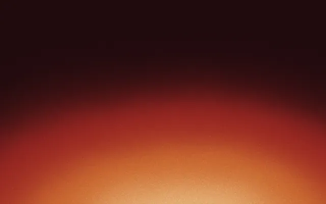
| Light at bottom, dark at top | Glowing, theatrical, like dawn or a stage | Night scenes, drama, product reveals |
| Left to right | Progress, time, a journey | Timelines, progress bars, banners |
| Diagonal | Energy, movement, momentum | Posts, buttons, covers, launches |
| Radial from a corner | A spotlight, a source of light | Heroes, covers, focus on one area |
Light from above
People tend to assume that light comes from above, because it almost always does, from the sun or a ceiling. A gradient that is lighter at the top matches that expectation, so it reads as natural and calm: sky over land, a lit wall, a softly lit object. Flip it so the light is at the bottom and the same colours feel theatrical, like a campfire, a stage or a screen glowing in the dark. Neither is wrong, but the second one should be a choice.
The same expectation affects buttons and cards. A surface that is slightly lighter at the top reads as raised; one that is lighter at the bottom reads as pressed in. That is worth knowing when you add a subtle gradient to a gradient button.
Diagonals and energy
Diagonal lines feel like movement, because they look unstable compared with verticals and horizontals. That is why diagonals, especially from top left to bottom right, are the most common choice for social posts, buttons and launch graphics. The top-left start also matches where readers of left-to-right languages begin a page, so the light end greets them first.
Steeper and shallower diagonals change the mood. Around 100 to 120 degrees feels almost vertical with a gentle lean, calm but not static. Around 150 to 160 degrees feels like late light raking across a surface. A precise 45 or 135 is the most dynamic, and also the most common, which is a reason to try something slightly different if you want to stand out; see two-colour gradients.
Keep the light away from the words
Direction is also layout. The bright end of a gradient pulls the eye, so place it where you want attention, and keep text on the calmer end where contrast is steadier. A headline at the top of a post suits a gradient that darkens towards the top, with the glow at the bottom corner, or the reverse with dark type.
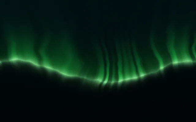
When the brightest part of the field lands on the headline, the words and the light compete.
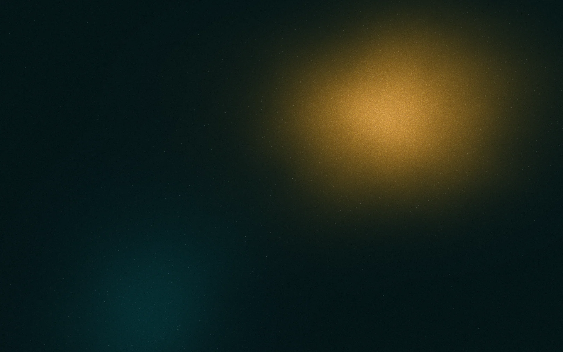
Light moved away from the words: the eye still travels, and the headline holds.
How gradient angles work in CSS
In CSS, a linear gradient's angle describes the direction the colours travel. 0deg points straight up, and angles turn clockwise: 90deg runs left to right, 180deg runs top to bottom, and 270deg runs right to left. If you leave the angle out, the default is 180deg. You can also use keywords such as to right and to bottom left.
/* These pairs are identical */
.a { background: linear-gradient(90deg,  #fde68a, #7c2d12); }
.b { background: linear-gradient(to right, #fde68a, #7c2d12); }

.c { background: linear-gradient(180deg, #fde68a, #7c2d12); }
.d { background: linear-gradient(#fde68a, #7c2d12); } /* default: to bottom */

/* These are only identical in a square box */
.e { background: linear-gradient(45deg, #fde68a, #7c2d12); }
.f { background: linear-gradient(to top right, #fde68a, #7c2d12); }The difference in the last pair matters on banners and stories. A fixed angle like 45deg always runs at 45 degrees, whatever the shape. A corner keyword like to top right tilts the angle to fit the box, so the midpoint colour runs exactly between the other two corners. On a wide 3:1 banner, to top right works out at about 18deg, much closer to vertical than 45deg, because the colour bands have to lie along the long diagonal. Use keywords when you want the gradient to go corner to corner on any shape; use degrees when you want the same slant everywhere.
| Keyword | Angle | Direction of travel |
|---|---|---|
to top | 0deg | Bottom to top |
to right | 90deg | Left to right |
to bottom | 180deg | Top to bottom (default) |
to left | 270deg | Right to left |
to bottom right | 135deg in a square only | Top left corner to bottom right corner |
Choosing a direction, step by step
- 1
Decide where the light comes from
Above for calm and natural, below for glow and drama, a corner for a spotlight.
- 2
Place the words first
Put the headline where it belongs in the layout, then run the gradient so its calm end sits behind it.
- 3
Pick the slant for the mood
Vertical for calm, diagonal for energy, horizontal for progress.
- 4
Check every format
A direction that works on a square may put the light in the wrong place on a story or banner. Adjust per size rather than cropping.
For the rest of the linear gradient syntax, see CSS linear gradients. For other shapes that don't have a single direction at all, see types of gradients. Marks in Gradiently are rendered for each size you design in, so their light lands in a sensible place on every format rather than wherever a crop leaves it.
Usein kysyttyä
What is the best angle for a gradient?
There is no single best angle. Lighter at the top feels natural and calm, diagonals around 135 degrees feel energetic, and the light end should sit away from your text.
Which direction does 0deg point in a CSS gradient?
Up. 0deg runs from bottom to top, and angles turn clockwise, so 90deg runs left to right and 180deg runs top to bottom.
What is the default direction of a CSS linear gradient?
Top to bottom, the same as 180deg or to bottom.
Is 45deg the same as to top right?
Only in a square box. to top right adapts to the box's shape so the gradient runs corner to corner, while 45deg keeps the same slant on any shape.
Why does my gradient look upside down after copying it from a design tool?
Many design tools measure angles differently from CSS. Check the direction visually and adjust the CSS angle.
Kirjoittanut Gradiently
Gradientlyn tiimi. Gradiently on Markien ympärille rakennettu suunnittelutyökalu: eläviä liukuvärejä, joiden ansiosta kaikki suunnittelemasi näyttää omaltasi.
Katso profiilimme