Tätä opasta ei ole vielä omalla kielelläsi, joten tässä se on englanniksi.
Lyhyesti
- A good gradient background starts with a ground colour, a small family of three to five related colours, a material or texture, and a planned place for words.
- Most gradient backgrounds look generic because they are two-colour presets in the same popular hues, blended in a straight diagonal.
- A dark or light ground decides the mood more than any single colour does, so choose it first.
- A little grain hides banding and makes a digital gradient feel like a surface rather than a screen default.
- Render the background for each format instead of cropping one image, so the brightest area always lands where the design needs it.
Tällä sivulla
To make a gradient background that doesn’t look generic, choose a ground colour first, add three to five related colours rather than two, give the surface a material such as grain or soft light, and keep a calm area where words will sit. Most gradient backgrounds skip every one of those steps: they take a two-colour preset, run it corner to corner and stop. That is why so many of them look interchangeable.
Why most gradient backgrounds look the same
Design tools, generators and templates all offer the same short list of blends, and trends push everyone towards the same hues at the same moment. Violet to pink, blue to cyan and orange to magenta are pleasant, but they are used so widely that they read as a default rather than a choice. The wider pattern is explained in why every feed looks the same.
Generic
- Two saturated colours from a preset
- A straight 45 degree diagonal
- Perfectly clean digital surface
- Colour spread evenly, no place for words
- One image stretched to every size
Considered
- A ground plus a family of three to five colours
- Light that comes from somewhere
- Grain, paper or sheen on the surface
- A calm zone planned for the headline
- Rendered fresh for each format
Step 1: choose a ground
The ground is the colour the gradient sits on and returns to. It sets the mood more than any accent. A near-black ground makes colour glow and feels premium and nocturnal; a warm off-white ground feels printed, calm and editorial. Pick one before you choose a single accent, and keep it for the whole set of designs.
If you choose dark, read dark gradient backgrounds before you export, because dark blends are where banding shows most.
Step 2: pick three to five related colours
Two colours are the easiest gradient to make and the easiest to copy. A small family gives depth: a shadow tone, a main tone, a lift, and one accent used sparingly. Keep neighbours close on the colour wheel so the blends stay clean, and let the accent sit apart. Opposite colours placed side by side will turn grey where they meet, which is covered in muddy gradients.
Step 3: give it a material
A clean digital blend looks like a screen default. A material makes it look like a surface. Grain reads as film or print, paper tooth reads as craft, a glassy sheen reads as technology and a soft silk reads as luxury. You don't need much: a noise layer at a low opacity is enough to change the feeling. Gradient texture compares the families, and grainy gradients has the code.
Step 4: plan where the words go
A background exists to carry something: a headline, a price, a date. Decide where those words sit before you finish the gradient, and keep that area calmer and higher in contrast. Put the brightest, busiest colour away from the text, usually in a corner, and let the ground show behind the words. For contrast rules, see colour contrast and accessibility.
Colour spread evenly means the brightest part can land right behind the words.
With a calm zone behind the text, the same background carries the message.
Step 5: render it for every format
A gradient that looks right as a square post can look wrong as a vertical story, because cropping moves the bright area. Treat the background as a recipe you render at each size, adjusting where the light lands, rather than a single image you crop.
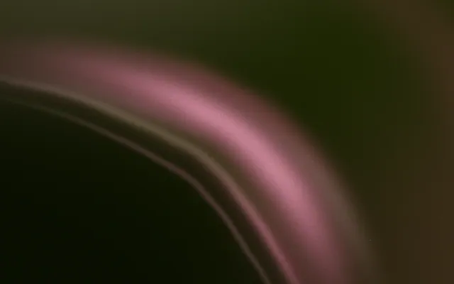
Post 1080×1350
1080 × 1350
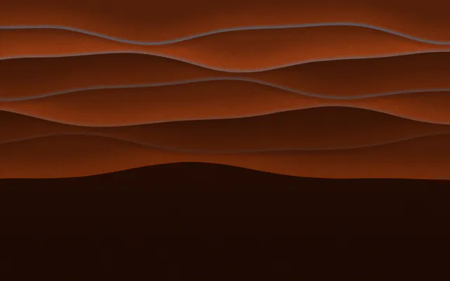
Story 1080×1920
1080 × 1920
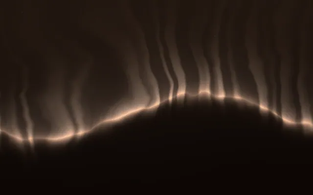
Website hero 1920×1080
1920 × 1080
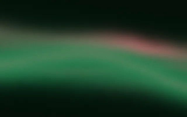
Blog banner 1200×600
1200 × 600
A gradient background in CSS
On the web, a full-page gradient has one classic bug: if the page is short, the background repeats in bands. Give the root element a minimum height, set a solid fallback colour that also shows during overscroll, then layer the gradient.
html {
  min-height: 100%;
  background-color: #0f0b1e; /* fallback, and the colour seen on overscroll */
}

body {
  min-height: 100vh;
  margin: 0;
  background-image:
    radial-gradient(circle at 80% 15%, #6d28d9 0%, transparent 45%),
    radial-gradient(circle at 10% 90%, #312e81 0%, transparent 50%),
    linear-gradient(160deg, #0f0b1e 0%, #1e1640 100%);
}For a hero section rather than a whole page, the same layers work on the section itself. Website hero backgrounds covers sizing and performance.
Owning your gradient background
Even a carefully made background can be sampled and reused. In Gradiently, a finished background is a Mark: a recipe of colours, materials, light, grain and motion with exactly one owner at a time. It renders at every size you design in and makes room for your words by itself. You can design with any Mark for free, and claim one to make it yours.
Usein kysyttyä
How do I make a gradient background look less generic?
Start with a ground colour, use three to five related colours instead of two, add grain or another material, and plan a calm area for words.
What colours make a good gradient background?
Colours that sit near each other on the colour wheel blend cleanly. Add one contrasting accent in a small area for interest.
Why does my CSS gradient background repeat in stripes down the page?
The root element is shorter than the window, so the gradient tiles. Set min-height: 100% on html and min-height: 100vh on body.
Should a gradient background be dark or light?
Either works. Dark grounds make colour glow and feel premium; light grounds feel printed and calm. Choose one and keep it consistent.
How do I stop banding in a gradient background?
Add a light grain layer and avoid heavy JPEG compression. Dark and subtle gradients band the most.
Kirjoittanut Gradiently
Gradientlyn tiimi. Gradiently on Markien ympärille rakennettu suunnittelutyökalu: eläviä liukuvärejä, joiden ansiosta kaikki suunnittelemasi näyttää omaltasi.
Katso profiilimme