Tätä opasta ei ole vielä omalla kielelläsi, joten tässä se on englanniksi.
Lyhyesti
- The best gradient colour combinations either use neighbouring hues, which blend cleanly, or bridge distant hues with a chosen middle colour.
- Calm gradients keep lightness and hue close together; bold gradients push saturation and hue distance.
- Dark gradients work best as a near-black ground with one lit colour, and pastel gradients work best as pale neighbours with a dark ink for text.
- Choosing a gradient by mood first, then by hue, gives more consistent results than picking colours you like one at a time.
- Any combination here can be made more distinctive with a third colour, a different angle or a layer of grain.
Tällä sivulla
The best gradient color combinations follow one of two rules: they use hues that sit next to each other on the colour wheel, so the blend stays clean, or they bridge distant hues with a chosen middle colour, so it never turns grey. Below are 60 combinations that follow those rules, grouped by mood: calm, bold, warm, cool, dark and pastel. Copy any swatch as CSS, then read the note under each group to see why they work, so you can make your own.
Everything here is plain CSS with hex colours, so it works in any browser, and the same codes can be typed into any design tool. If a term is new, what a gradient is explains stops and angles.
Calm gradient combinations
Calm gradients keep their colours close in both hue and lightness. Nothing jumps, so the eye rests. They make good backgrounds for reading, wellbeing brands, portfolios and anything that should feel quiet. Sage and stone, for example, moves only a small distance around the wheel and loses a little lightness as it goes, which reads as shade on a wall rather than a colour effect.
Bold gradient combinations
Bold gradients use saturated colours and more distance around the wheel. They grab attention on a crowded feed, a sale banner or a launch page. The trick is choosing pairs whose straight blend stays bright. Magenta to amber passes through coral; cobalt to coral passes through purple. Neither goes near grey, which is why they look vivid all the way across.
Warm gradient combinations
Warm gradients live between red and yellow and feel sunny, appetising and human. They suit food, hospitality, lifestyle and anything personal. Most of these add a darker, redder end so the blend has weight: Golden hour runs from pale honey to burnt amber the way late light moves down a wall. For the psychology of temperature, see warm and cool colours.
Cool gradient combinations
Cool gradients sit between green and violet and feel clean, calm and precise. They are the natural home of technology, health, finance and water. Blue is the anchor of most of them, which is why they look trustworthy, and why a cool gradient needs a distinctive detail, such as a violet end or a teal shift, to avoid looking like every bank. More blues are collected in blue gradients.
Dark gradient combinations
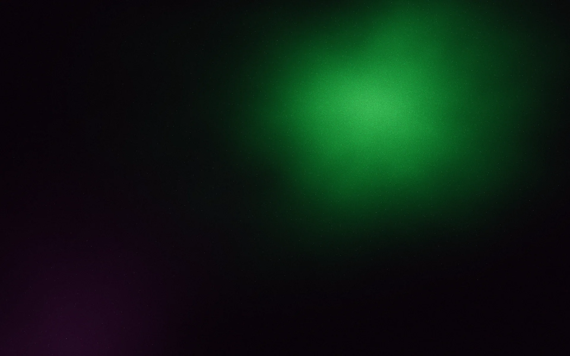
Dark gradients are near-black grounds with one lit colour rising out of them. They feel premium, nocturnal and cinematic, and they make white type look sharp. Keep the dark end slightly coloured rather than pure black, so the blend has something to travel through. Dark ramps band easily, so add grain before you publish; see dark gradient backgrounds.
Pastel gradient combinations
Pastels are pale, high-lightness colours with a little saturation. They feel fresh, soft and friendly, and they suit beauty, baby, stationery and spring campaigns. Because they are all so light, even distant pastel hues can blend into a whitish grey, so the last two here route through a pale lilac. Set text on pastels in a dark ink rather than white. There is more in pastel gradients.
How to use these gradient codes
Each code is a complete CSS background value. Paste it on any element, or read the hex colours and stop positions into a design tool. On the web, set a solid fallback colour first, taken from the darkest or most important stop.
.card {
  background-color: #3b1d6e; /* fallback */
  background-image: linear-gradient(135deg, #0f0b1e 0%, #3b1d6e 55%, #7c3aed 100%);
  color: #ffffff;
}How to make your own combination
- 1
Pick the mood first
Decide calm or bold, warm or cool, dark or light before any colour. It narrows the choices to one of the groups above.
- 2
Choose an anchor colour
Usually your brand colour or the colour of the thing you are selling. See how to choose brand colours.
- 3
Add a neighbour
Move 30 to 60 degrees around the colour wheel for a clean second colour. Change lightness a little too, for depth.
- 4
Bridge anything distant
If you want a far-away hue, put a bright middle colour between them so the blend doesn't go grey. See muddy gradients.
- 5
Make it yours
Change the angle, move a stop off 50%, add a third colour or a layer of grain. Small changes are what stop a combination looking like a preset.
A popular code is a good start, but thousands of other designs start there too. If you want a gradient identity nobody else holds, you can match a picture you love to its palette and the closest Marks, or make new ones like it.
Usein kysyttyä
What colours go well together in a gradient?
Colours next to each other on the colour wheel, such as blue and violet or orange and pink, always blend cleanly. Distant colours work when a bright middle colour bridges them.
What is the most popular gradient combination?
Violet to pink and blue to cyan are among the most widely used. That popularity is also why they rarely look distinctive.
How many colours should a gradient have?
Two is simplest, three gives depth and control over the midpoint, and more than five is hard to keep clean.
What colour text works on a gradient?
White or near-white on dark and bold gradients, and a dark ink on pastel and calm ones. Check contrast at the lightest point behind the text.
Can I use these gradient codes in Figma or Canva?
Yes. Copy the hex colours and their stop positions into the tool's gradient fill and match the angle.
Kirjoittanut Gradiently
Gradientlyn tiimi. Gradiently on Markien ympärille rakennettu suunnittelutyökalu: eläviä liukuvärejä, joiden ansiosta kaikki suunnittelemasi näyttää omaltasi.
Katso profiilimme