Tätä opasta ei ole vielä omalla kielelläsi, joten tässä se on englanniksi.
Lyhyesti
- A radial gradient blends colour outward from a centre point in circles or ellipses, instead of along a straight line.
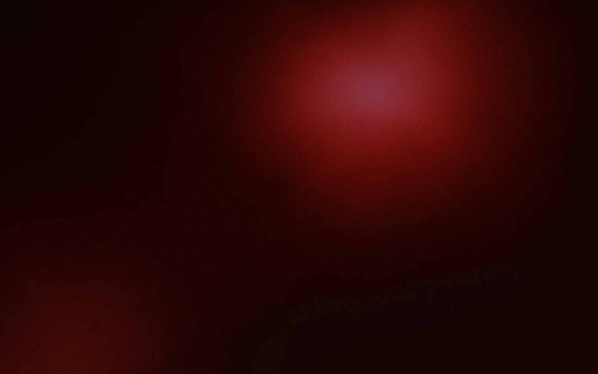
- Because the eye goes to the brightest area, a radial gradient works like a spotlight that tells people where to look first.
- The most useful radial gradients are placed off centre, behind the subject or partly outside the frame, not dead in the middle.
- An ellipse follows the shape of its container, while a circle keeps its proportions, which matters on tall and wide formats.
- Dark radial glows band easily, so give them room to fade and add a little grain.
Tällä sivulla
A radial gradient is a blend that spreads outward from a single point, in rings, rather than travelling in one direction. The centre holds one colour and each ring moves towards the next. Because our eyes go to the brightest, most saturated area of a picture first, a radial gradient acts like a spotlight: you decide where attention lands, then place your headline, product or face there.
This guide is about using radial gradients in design. For the full syntax, see CSS radial-gradient(); for how it compares with linear, conic and mesh, see types of gradients.
What a radial gradient does to a layout
A linear gradient suggests direction: light from above, a horizon, a sweep. A radial gradient suggests a source. That source becomes the natural focal point, so anything placed on it feels intentional and anything placed at the edges feels secondary. It is one of the simplest ways to build visual hierarchy without adding a single shape.
radial-gradient(circle at 50% 38%, #fde68a 0%, #f59e0b 14%, #7c2d12 42%, #1c0a05 78%)Circle or ellipse
In CSS a radial gradient is an ellipse by default, stretched to the proportions of its box. On a wide banner that means a flat, wide glow; on a tall story it becomes a tall oval. A circle keeps the same shape at any size, which reads more like a real light source.
Use an ellipse when you want the glow to fill the format evenly, as with a vignette. Use a circle when the gradient should look like one lamp, a sun or a halo behind a single object.
Where to place the centre
A glow in the dead centre of a square is the most common radial gradient and the least interesting. It looks like a target. Moving the centre changes the whole mood of the piece.
- Behind the subject. Put the glow directly behind a product or portrait so it separates from the background.
- On a third. Placing the source near a third of the width or height feels balanced without being static.
- Outside the frame. A centre below or beside the canvas gives a soft edge of light, like a sunrise or a lamp just out of shot.
- Away from the text. If the brightest point sits under white type, contrast drops exactly where you need it most.
Four jobs radial gradients do well
Spotlight and focus
A bright centre on a dark ground points at whatever sits on it. It suits product shots, event posters and announcement posts where one thing matters.
Vignette
The reverse: a lighter middle fading to darker edges. A subtle vignette pulls the eye inward and makes a flat background feel photographed. Keep the change small, or it looks like an old camera filter.
radial-gradient(ellipse at center, #f5efe6 0%, #efe4d3 55%, #cdb89a 100%)Glow and halo
A small, saturated circle that fades to transparent reads as light coming off something: a neon sign, a screen, an icon. Layer two or three of these at different positions and you are halfway to an aurora gradient.
Fields of colour
Stack several radial gradients with transparent edges and they blend into a soft, organic field. This is how most CSS mesh gradients are faked.
.poster {
  background:
    radial-gradient(circle at 20% 25%, rgb(244 114 182 / 0.85) 0%, transparent 45%),
    radial-gradient(circle at 80% 30%, rgb(56 189 248 / 0.75) 0%, transparent 50%),
    radial-gradient(circle at 50% 95%, rgb(250 204 21 / 0.7) 0%, transparent 55%),
    #0f0a1f;
}Radial gradients with text
A poster where the lit area sits behind the headline.
A story with the text kept in the calm, darker field.
Decide which of two jobs the glow has. Either it frames the words, with dark type on the light centre, or it frames the space next to the words, with light type on the dark surround. Trouble starts when the edge of the glow cuts through a line of text, because contrast changes halfway along it. Text on a gradient has more on finding the calm zone.
Common radial gradient problems
Avoid
- A centred glow on every design, like a target
- A hard ring where two stops sit too close
- A dark glow that fades over a short distance and bands
- An ellipse stretched thin across a wide banner by accident
Do
- Place the source where the subject or light would be
- Spread stops so the fall-off feels like real light
- Give dark glows a long fade and a little grain
- Choose circle or ellipse on purpose for each format
Banding is the one to watch. A glow from deep navy to black covers very few colour levels over a large area, so it steps. Let the fade travel further and add grain, as described in gradient banding.
Usein kysyttyä
What is a radial gradient?
A radial gradient blends colours outward from a centre point in circles or ellipses, rather than along a straight line like a linear gradient.
What is the difference between a circle and an ellipse radial gradient?
An ellipse stretches to match the proportions of its container, while a circle keeps the same round shape at any size. In CSS the default is an ellipse.
When should I use a radial gradient instead of a linear one?
Use a radial gradient when you want a focal point, a glow or a vignette. Use a linear gradient when you want direction, like light from above or a horizon.
Why does my radial gradient look like a target?
It is probably centred with stops that are close together. Move the centre off the middle or outside the frame, and spread the stops so the light fades gradually.
Kirjoittanut Gradiently
Gradientlyn tiimi. Gradiently on Markien ympärille rakennettu suunnittelutyökalu: eläviä liukuvärejä, joiden ansiosta kaikki suunnittelemasi näyttää omaltasi.
Katso profiilimme