Tätä opasta ei ole vielä omalla kielelläsi, joten tässä se on englanniksi.
Lyhyesti
- A gradient wallpaper is a smooth blend of colours used as a desktop or phone background, chosen because it stays calm behind icons, widgets and windows.
- Make desktop wallpapers at your screen's exact resolution in its own shape, usually 16:9, and phone wallpapers tall, with extra height above 9:16.
- Large, smooth gradients are where banding shows most, so add fine grain and export as PNG rather than a compressed JPEG.
- Place the lightest or busiest part of the gradient away from where icons, the clock and widgets sit.
- Blending colours in OKLCH keeps rainbow and complementary gradients vivid instead of turning grey in the middle.
Tällä sivulla
A gradient wallpaper is a smooth blend of colours used as the background of a desktop or phone. It works because it has no details to compete with icons, widgets and windows, and it changes the whole mood of a screen with colour alone. To make a good one: choose a family of three to five colours, blend them softly with the light where you want the eye to rest, export at your screen's exact size and shape, and add fine grain so the blend stays smooth instead of showing stripes.
Below you will find ready-made gradients to copy, the method for making your own, and how to fit each to a screen. For more colour combinations, see gradient colour combinations.
Gradient wallpaper ideas with codes
Each of these is a single CSS gradient, so you can preview it in a browser, adapt the colours and export it at any size. They are grouped loosely from bright to dark.
How to make a gradient wallpaper
- 1
Find your screen's size
Check your display settings for the resolution, and your phone's specifications for its screen size. Design at that exact size, or larger in the same shape.
- 2
Pick a colour family
Three to five colours with a clear relationship: neighbouring hues for calm, a warm and cool pair for energy. Analogous colours are the easiest route.
- 3
Place the light
Decide where the brightest area goes. On a desktop, away from icons; on a phone, usually behind the clock or lower centre.
- 4
Blend smoothly
Spread the stops out, and blend in OKLCH if colours are far apart on the wheel, so the middle doesn't turn grey.
- 5
Add grain
A fine noise layer at low strength. It hides banding and makes the colour feel richer.
- 6
Export as PNG
Lossless export keeps the blend smooth. A heavily compressed JPEG is the most common cause of stripes.
If you want to build one in the browser, set a gradient on a full-screen page and blend it in OKLCH. Modern browsers support colour interpolation in gradients, which keeps vivid colours vivid through the middle of the blend.
<!doctype html>
<html>
<head>
<style>
  html, body { margin: 0; height: 100%; }
  body {
    background:
      radial-gradient(ellipse at 25% 20%, oklch(0.78 0.14 20 / 0.9), transparent 60%),
      linear-gradient(135deg in oklch, oklch(0.62 0.2 300), oklch(0.72 0.15 200));
  }
</style>
</head>
<body></body>
</html>Desktop and phone wallpaper shapes
A wallpaper looks best when it is made for its screen's shape, not cropped from another. Most desktop displays are 16:9 or close to it; laptops are often a little taller, around 16:10. Phones are much taller than 16:9: many are around 9:19.5. Design each shape separately and let the light fall in the right place for each.
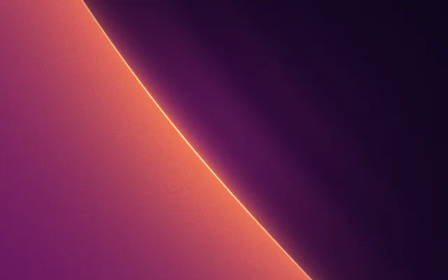
Desktop 16:9
1920 × 1080
Laptop 16:10
1600 × 1000
Tall phone, about 9:19.5
900 × 1950
With two or more monitors, you can either set one image per screen or make one wide image at the combined width of both. The second option lets a single gradient flow across the desk, but the join between screens will cut through it, so keep the light away from that edge.
Phones add two complications: the lock screen clock and widgets sit over the top third, and some phones move the wallpaper slightly as you tilt, which crops the edges. Phone wallpaper size covers both in detail.
Keeping gradient wallpapers smooth
Wallpapers are shown large, often on bright, high-quality screens, which makes them the harshest test of a gradient. The two problems you will see are banding, where a smooth blend breaks into visible steps, and muddy middles, where two strong colours meet in grey.
Causes stripes and mud
- Close, dark colours over a large area
- Heavy JPEG compression
- Complementary colours blended in sRGB
- A perfectly smooth blend with no noise
Keeps it smooth
- Enough colour range across the blend
- PNG or high-quality export
- OKLCH blending, or a midpoint colour
- Fine grain over the whole image
The deeper explanations live in gradient banding and muddy gradients. For wallpapers, grain is the simplest fix: it breaks the steps up so the eye sees one continuous blend, and it makes flat digital colour feel like film.
Dark or light gradient wallpapers
Dark wallpapers are easier on the eyes at night and make colourful icons stand out; they also band more easily, so grain matters more. Light wallpapers feel airy but can make white text on widgets hard to read. If your phone switches between light and dark appearance, consider a pair: the same hues, one version lifted and one deepened.
GR·N10S·5T
Cameo Bolero
Katso tämä MarkIn Gradiently, you can design with any Mark at custom sizes up to 8,000 pixels on the long side, so one look can become a desktop, laptop and phone wallpaper. Marks also export as 5 to 30 second looping videos if you want a live wallpaper.
Usein kysyttyä
What size should a gradient wallpaper be?
Your screen's exact resolution, or larger in the same shape. Desktops are usually 16:9 or 16:10; phones are taller, often around 9:19.5, so check your model.
Why does my gradient wallpaper have stripes?
That is banding: the screen shows a smooth blend in visible steps. Export as PNG, avoid heavy compression, and add fine grain to hide it.
How do I make a rainbow gradient wallpaper that doesn't look cheap?
Use part of the spectrum rather than all of it, keep the colours at similar lightness, and blend in OKLCH so the colours stay vivid between stops.
Are dark wallpapers better for a phone?
They are easier to look at in dim light and make icons stand out. On phones with OLED screens, dark wallpapers can also use a little less power, but choose the one you like looking at.
Kirjoittanut Gradiently
Gradientlyn tiimi. Gradiently on Markien ympärille rakennettu suunnittelutyökalu: eläviä liukuvärejä, joiden ansiosta kaikki suunnittelemasi näyttää omaltasi.
Katso profiilimme