The short version
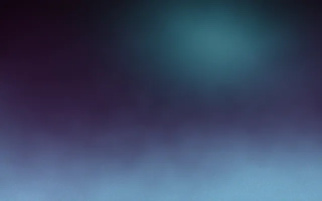
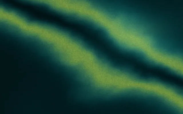
- An aurora gradient is a dark background with soft, heavily blurred pools or veils of luminous colour, modelled on the northern lights.
- Aurora gradients work because light colours on a near-black ground appear to glow, the way real light does at night.
- The most convincing aurora palettes stay close to the colours of the real aurora: greens, teals, violets and a touch of rose.
- An aurora gradient looks like a screensaver when it uses too many saturated colours, moves too fast or fills the whole frame evenly.
- Text on an aurora belongs in the darkest area, with the brightest veil kept away from the words.
On this page
An aurora gradient is a background of soft, luminous colour floating over a dark ground, like the northern lights: veils of green, teal and violet that seem to glow rather than sit on the surface. Technically it is a set of heavily blurred colour pools or bands on a near-black base, often moving very slowly. It is one of the most atmospheric looks a gradient can have, and one of the easiest to overdo.
What makes an aurora gradient different
Three things separate an aurora from an ordinary dark gradient. First, the ground is very dark, close to black, so any colour on it reads as light. Second, the colour comes in soft, uneven veils or pools rather than a smooth ramp from one side to the other. Third, the edges are extremely blurred, so nothing has a shape you can trace. Together they create the impression of light in air rather than paint on a wall.
Aurora palettes that work
The real aurora gets its colours from gases high in the atmosphere: oxygen gives the familiar green and, higher up, a deep red, while nitrogen adds blues and purples. Staying near that family is why some aurora gradients look natural and others look like a nightclub. Start with a green or teal, add a violet, and use rose or red as a rare accent.
You can move away from nature, of course. Warm auroras in amber and coral, or monochrome ones in a single blue, both work, as long as the ground stays dark and the colours stay neighbours. For more on picking colours that sit together, see analogous colours.
How to keep an aurora from looking like a screensaver
Screensaver
- Five or more fully saturated colours
- Colour spread evenly edge to edge
- Fast, looping movement you can follow
- Perfectly smooth, visibly banded dark areas
- Centred, symmetrical blobs
Aurora done properly
- Two or three related colours on near-black
- Most of the frame left dark, light in one region
- Movement so slow you notice it only on a second look
- Fine grain over the dark areas
- Veils that lean and drift off one edge
Darkness is the most important ingredient. An aurora needs more dark area than lit area, because the glow only reads against it. That same darkness is where banding shows first: long, subtle ramps from dark teal to black step visibly on most screens. A fine grain fixes it, as explained in gradient banding and dark gradient backgrounds.
How to build an aurora gradient in CSS
The usual technique is a few radial gradients shaped as wide, flat ellipses, blurred together on an oversized layer behind the content. Blurring a pseudo-element costs more than a plain gradient, so keep the layer count low and the animation slow, and stop the movement for anyone who prefers reduced motion.
.aurora {
  position: relative;
  overflow: hidden;
  background: #030712;
}

.aurora::before {
  content: "";
  position: absolute;
  inset: -20%;
  background:
    radial-gradient(ellipse 40% 22% at 30% 30%, #34d399cc, transparent 70%),
    radial-gradient(ellipse 35% 20% at 62% 26%, #22d3eeaa, transparent 70%),
    radial-gradient(ellipse 30% 18% at 52% 48%, #8b5cf699, transparent 70%);
  filter: blur(40px);
  animation: aurora-drift 30s ease-in-out infinite alternate;
}

.aurora > * {
  position: relative; /* keep content above the light */
}

@keyframes aurora-drift {
  to { transform: translate3d(4%, -3%, 0) rotate(5deg); }
}

@media (prefers-reduced-motion: reduce) {
  .aurora::before { animation: none; }
}For more on animating gradients smoothly, see animated gradient backgrounds. For respecting motion preferences, see reduced motion.
Type on an aurora
Aurora backgrounds are generous to type, because most of the frame is dark. Set light type in the darkest region and keep the brightest veil well away from the words. The mistake is centring the glow and the headline together, so the letters sit on the one area with the least contrast.
Light and words compete when the glow runs straight behind the headline.
With the dark ground behind the words, the aurora frames them instead.
Where aurora gradients fit
- Music, sleep, meditation and wellbeing brands, where calm light suits the product
- Night events, planetariums, astronomy and travel to northern places
- Technology launches that want atmosphere without neon
- Wallpapers and lock screens; see gradient wallpaper
- Looping video backgrounds, where slow drift is the whole point
It fits less well where people need to read a lot or compare numbers. Dashboards, pricing tables and long articles want a quiet, even surface, and a drifting glow behind them becomes a distraction. It also fights bright, daytime brands: a bakery or a children's toy shop will look strange wrapped in polar night. In those cases, borrow only the softness, as a single pale glow on a light ground.
Because an aurora depends on slow movement, it is at its best as a loop rather than a still. In Gradiently, designs made with a Mark you have claimed export as 5 to 30 second seamless loops, with the movement and pace you choose.
Questions people ask
What is an aurora gradient?
An aurora gradient is a dark background with soft, blurred veils or pools of luminous colour, inspired by the northern lights.
What colours are best for an aurora gradient?
Greens, teals and violets on a near-black ground look the most natural, with rose or red as a rare accent. Keep to two or three colours.
How do I make an aurora gradient in CSS?
Stack a few wide, flat radial-gradient ellipses on a pseudo-element, blur it with filter: blur(), place it over a near-black background and animate it slowly.
Why does my aurora gradient have stripes?
Long, subtle dark ramps show banding on most screens. Add fine grain over the dark areas and avoid heavy compression.
Where should text go on an aurora gradient?
In the darkest area, away from the brightest veil, so light type has the most contrast.
Written by Gradiently
The team behind Gradiently, a design tool built around Marks: living gradients that make everything you design look like yours.
See our profile