The short version
- A mesh gradient is a gradient where several points of colour blend with each other in two dimensions, instead of along one line or out from one centre.
- Mesh gradients look organic because they have no single direction, so they read like light, water or paint rather than geometry.
- CSS has no mesh gradient type, but stacking soft radial gradients over a dark or light base colour gives a convincing result.
- The two common failures are mud, where opposite colours meet and go grey, and banding, where subtle blends break into stripes.
- Three to five colours from a related family, one base colour and a little grain are enough for most mesh gradients.
On this page
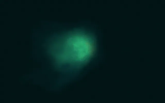
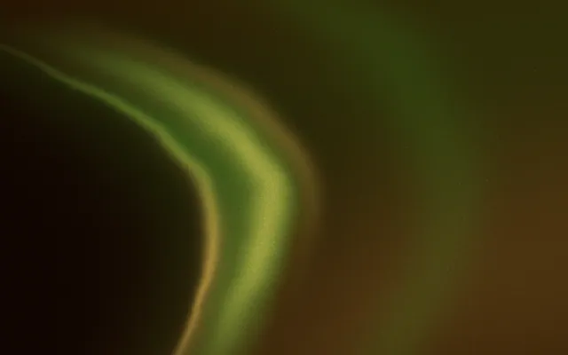
A mesh gradient is a gradient built from several points of colour spread across a surface, each blending into its neighbours in every direction at once. A linear gradient moves along one line and a radial gradient spreads from one centre; a mesh has no single path, so colour pools, drifts and overlaps like light through water. That is why mesh gradients feel organic, and why they have become the default look for hero sections, wallpapers and album art.
This guide explains how a mesh works, how to make one in CSS and in design tools, and how to avoid the grey patches and stripes that make so many of them look cheap. For the other shapes, see types of gradients.
What makes a gradient a mesh
In a true gradient mesh, such as the one in Adobe Illustrator, the surface is divided into a grid. Each point on the grid holds a colour, and the software blends smoothly between neighbouring points, bending the grid to steer the colour. Freeform gradients drop the grid and let you place colour points anywhere. Web and social mesh gradients usually take a third route: soft blobs of colour laid over a base and blended together.
All three share one idea. Every pixel's colour is a mix of the nearby colour points, weighted by how close they are. Move one point and only its neighbourhood changes, which is what lets a mesh feel hand-made rather than calculated.
Why mesh gradients feel organic
Linear or radial
- One direction or one centre
- The eye follows the line or the target
- Feels designed and geometric
- Easy to recognise as a preset
Mesh
- Several colour points, no single direction
- The eye wanders and rests
- Feels like light, water or paint
- Every arrangement is slightly different
That wandering quality is also the danger. With no structure, a mesh can look like a random blur. Good ones have a composition: a bright area where the eye lands first, a darker area that gives it weight, and a calm area where words can sit.
How to make a mesh gradient in CSS
- 1
Set a base colour
Choose a dark or light ground. It shows through wherever the colour pools fade out, so it decides the overall mood.
- 2
Place three to five colour pools
Each pool is a
radial-gradientcentred at a position withat x% y%, fading totransparent. Put them near corners and edges rather than in the middle. - 3
Let them overlap
Fade each pool out between 45% and 60% of the way so neighbours meet. Overlaps are where the mesh gets its richness.
- 4
Leave a calm zone
Keep one area mostly base colour, usually where your headline will go. See text on a gradient.
- 5
Add grain
A light noise layer hides stripes and adds depth. Grainy gradients shows the code.
.mesh {
  background-color: #0b1026;
  background-image:
    radial-gradient(at 12% 18%, #7c3aed 0px, transparent 55%),
    radial-gradient(at 88% 12%, #0ea5e9 0px, transparent 50%),
    radial-gradient(at 80% 88%, #14b8a6 0px, transparent 55%),
    radial-gradient(at 20% 92%, #f472b6 0px, transparent 45%);
}Because the pools are percentages, the mesh rescales with its box. On very different shapes, such as a tall story and a wide banner, adjust the at positions so the bright area still lands where you want it. The same palette can be animated slowly by moving those positions; animated gradient backgrounds covers how to do that without hurting performance.
Making a mesh gradient in design tools
In tools with a real mesh or freeform gradient, place your colour points directly and drag them until the composition works. In tools without one, the blur method works everywhere: draw three to five soft shapes in your colours on a base rectangle, blur them heavily, often by a quarter of the canvas width or more, and let them overlap. Then add a grain layer on top and export at the final size rather than scaling up.
Words laid straight over a busy part of the mesh fight the colour.
The same mesh with a calm zone behind the words reads at a glance.
Mesh gradient mistakes and how to fix them
| Problem | Why it happens | Fix |
|---|---|---|
| Grey or brown patches | Opposite colours, such as orange and blue, meet and cancel out | Keep neighbouring pools close in hue, or separate opposites with a third colour. See muddy gradients |
| Visible stripes | Large, subtle blends step between the shades a screen can show | Add grain and avoid heavy JPEG compression. See gradient banding |
| A blob in the middle | Pools centred on the canvas look like a target | Push pools to edges and corners |
| Rainbow noise | Too many unrelated colours | Three to five colours from one family plus one accent |
| No place for words | Colour evenly spread across the whole surface | Plan a calm zone before you place the pools |
A mesh is only as good as its palette. If you are unsure which colours will blend cleanly, start with an analogous colour family and add one contrasting accent at a single pool.
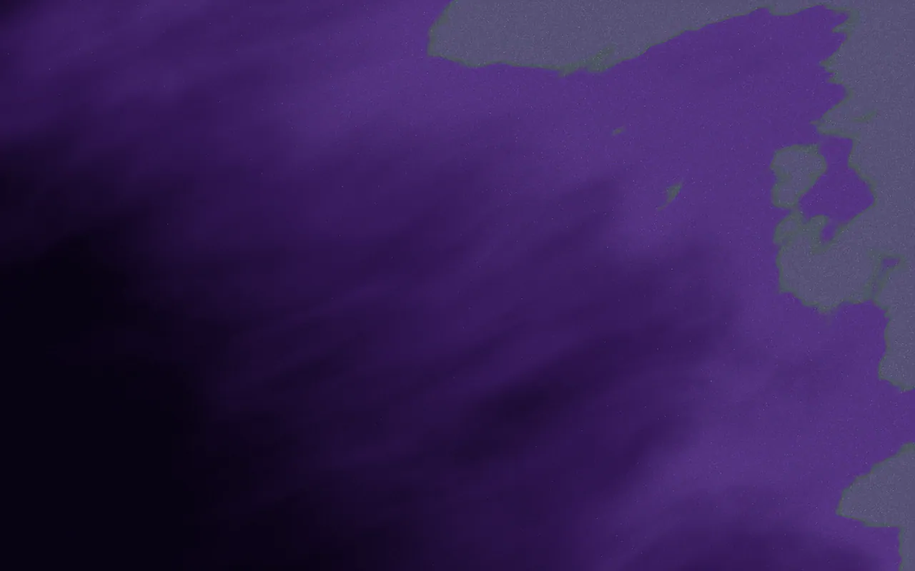
GR·FVZ6·KW
Thin Dune
See this MarkIf you would rather describe a mesh than build one, the Forge makes new Marks from a sentence or control by control, with up to eight colours and three stacked materials.
Questions people ask
What is a mesh gradient?
A mesh gradient blends several points of colour across a surface in two dimensions, so colour pools and overlaps organically instead of following one line or one centre.
Can you make a mesh gradient in CSS?
Yes, by approximation. Stack three to five radial-gradient layers, each fading to transparent, over a base background colour.
How many colours should a mesh gradient have?
Three to five colours plus a base usually works best. More than that tends to look like rainbow noise rather than a composed field.
Why does my mesh gradient look muddy?
Opposite colours are meeting and blending towards grey. Keep neighbouring colours close in hue, or put a bridging colour between opposites.
What is the difference between a mesh gradient and a freeform gradient?
A classic gradient mesh holds colours on a grid of points you can bend. A freeform gradient lets you place colour points anywhere without a grid. Both blend in two dimensions.
Written by Gradiently
The team behind Gradiently, a design tool built around Marks: living gradients that make everything you design look like yours.
See our profile