The short version
- Podcast cover art for Apple Podcasts is a square image at 3000×3000 pixels, saved as JPEG or PNG in the RGB colour space.
- Most people see a podcast cover at thumbnail size in a grid or list, so it must read when very small.
- Keep the title to a few words set large, use one strong image or colour field, and avoid fine detail and small text.
- A cover stands out in a grid through a distinctive colour field and shape, not through more elements.
- Episode art and promotion graphics should reuse the cover's ground, type and layout so every episode looks like the same show.
On this page
Great podcast cover art is a square image, 3000×3000 pixels for Apple Podcasts, that reads clearly when it shrinks to a thumbnail in a grid of other shows. That means a short title set large, one strong image or colour field, high contrast and no fine detail. Design it at full size, but judge it at the size of a fingertip, because that is how most listeners will meet it.
This guide covers the size and file rules, how to design for the thumbnail, how to stand out in a crowded grid, and how to keep episode art and promotion consistent with the cover. If the show is part of a wider personal brand, creator branding covers the bigger picture.
Podcast cover art size and file rules
| Rule | What to use |
|---|---|
| Shape | Square, 1:1 |
| Size | 3000×3000 px, the size Apple Podcasts recommends |
| File type | JPEG or PNG |
| Colour space | RGB, not CMYK |
| Content | The show's title, and nothing that only reads when enlarged |
Your cover will also be promoted in other shapes: a story when a new episode drops, a video thumbnail if you publish the show on YouTube, a feed post. Plan those formats alongside the cover so the show looks the same everywhere.
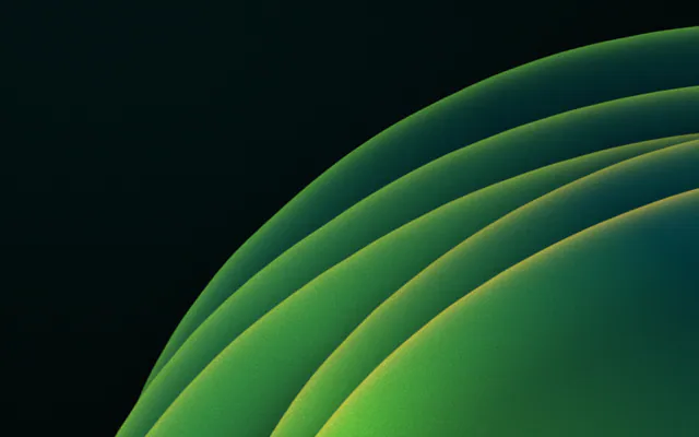
Podcast cover 1:1
3000 × 3000

Episode story 9:16
1080 × 1920
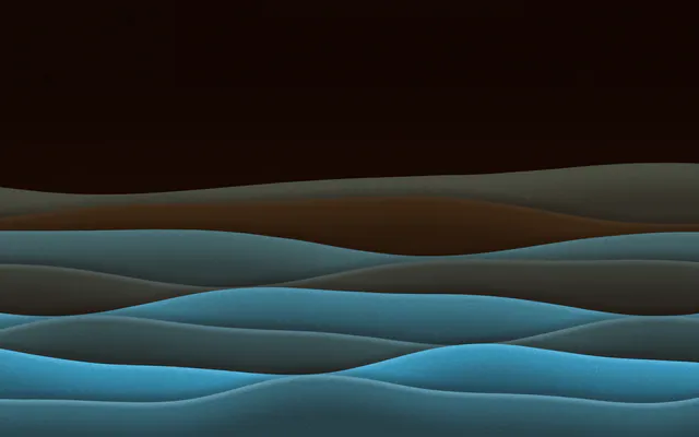
Video thumbnail 16:9
1280 × 720
Feed post 4:5
1080 × 1350
Design for the thumbnail, not the poster
At 3000 pixels, anything looks good. The question is what survives when the cover is a small square in a list. Most failed covers fail here: too many words, a detailed photo, thin type.
Too many words. At thumbnail size the smaller lines turn into texture.
Two words, set large. It reads at any size, and the background does the rest.
- 1
Cut the title to its core
Use the show's name only. Taglines, host names and schedules belong in the description, not on the cover.
- 2
Set it big and heavy
A bold or display font at a size that fills much of the width. Thin strokes vanish when small.
- 3
Use one image or field
One face, one object or one colour field. Busy collages become noise at thumbnail size.
- 4
Check contrast
Title against background must be clearly readable; see text on a gradient if your cover uses one.
- 5
Test it small
Shrink the cover to about the size of a fingernail on your phone screen. If you can't read the title, the listener won't.
How to stand out in a grid of podcast covers
Browse any podcast category and patterns appear quickly: studio microphones, headphones, big smiling host photos, black backgrounds with one bright accent. Covers that follow the pattern disappear into it. What stands out is usually simpler, not busier.
Blends into the grid
- Microphone and headphone icons
- A host photo cut out on a busy background
- Several fonts and a long subtitle
- The same colours as the category's best-known shows
Stands out
- A distinctive colour field or material nobody else in the category uses
- One or two words, set with confidence
- A clear shape that reads from far away
- A look that carries on into every episode
The most honest test is the real grid. Take a screenshot of your category's top shows in a listening app, drop your cover into the middle of it, and look from arm's length. If your eye doesn't land on yours, change the colour field before you change anything else. Colour is what people notice first at that size; the words come second.
Episode art and series consistency
Some apps show episode-level artwork. Treat it as a variation of the cover, never a new design: the same ground, the same type and layout, with the episode number or guest name added. When listeners scroll your episodes, they should see one show.
A new-episode story built from the cover: same ground, same title, the episode number and topic added.
If you publish the show as video, the same principles apply to thumbnails, with a wider canvas: see YouTube thumbnail size. In Gradiently, the podcast cover is one of the built-in sizes, and copy to sizes lays the finished cover out again as a story, thumbnail or post, so every format wears the same look.
Questions people ask
What size should podcast cover art be?
A square 3000×3000 pixels, as JPEG or PNG in RGB, which is what Apple Podcasts recommends and most apps reuse.
What should be on a podcast cover?
The show's title set large, and one strong image or colour field. Leave taglines, schedules and host lists for the description.
How do I make my podcast cover stand out?
Use a distinctive colour field or material that others in your category don't, keep the title to one or two words, and avoid common icons like microphones.
Should every episode have its own artwork?
It can, but episode art should be a variation of the cover, with the same ground, type and layout, so the show stays recognisable.
Can I use a gradient on a podcast cover?
Yes. A strong gradient or material makes a clean, distinctive colour field, as long as the title has enough contrast where it sits.
Written by Gradiently
The team behind Gradiently, a design tool built around Marks: living gradients that make everything you design look like yours.
See our profile