The short version
- Before product-market fit, startup branding should aim for credible and consistent, not complete.
- Lock the few things that are expensive to change later, such as the name, domain and a simple wordmark, and leave positioning and messaging flexible.
- A minimum credible brand is a wordmark, a small palette or one gradient identity, one or two typefaces, a consistent background look and a few templates.
- Launch assets come in fixed sizes, such as a 1200×630 link preview, a 1500×500 X header and 1920×1080 slides, so make them as one set.
- Invest in a full brand once you know who the product is for and why they stay, because that is when the story stops changing.
On this page
Startup branding before product-market fit should do two things: make you look credible enough that strangers try the product, and stay flexible enough that it doesn't fight you when the product changes. In practice that means locking the few things that are expensive to change, such as the name, domain and a simple wordmark, and keeping a small, consistent look for everything else. Leave the grand brand story for later, when you know who stays and why.
Early teams tend to fail in one of two directions: weeks spent on a full identity for a product that pivots a month later, or a scrappy mix of fonts and colours that makes a good product look unfinished. This guide is the middle path.
What to lock now, and what to leave open
Some brand decisions get more expensive every week you wait. Others get more expensive every week you commit to them too early. Sort them before you start.
Lock now
- A name you can own, with the domain and social handles
- A simple wordmark that works in one colour
- Two or three colours, or one gradient identity
- One or two typefaces
- A consistent background look for every asset
Leave open
- Your tagline and positioning statement
- Detailed messaging for each audience
- An elaborate symbol or illustrated mascot
- Photography style and art direction rules
- The full brand book
The logic is simple. The left column is how people find and recognise you, and changing it later costs you the recognition you've built. The right column is what you say, and what you say should change as you learn.
The minimum credible brand
Credibility comes mostly from consistency. A startup with one wordmark, a tight palette and the same background look on its website, deck and posts reads as a company. One with five fonts reads as a side project, however good the product is.
- 1
A wordmark, not a symbol
Set the name in a good typeface with careful spacing. Symbols take longer to earn meaning; a wordmark works from day one and survives a pivot.
- 2
A small palette
A dark, a light, one main colour and one accent. Or one gradient identity with a flat fallback colour for small sizes.
- 3
One or two typefaces
One for headlines, one for text, or one family in two weights. Brand fonts covers how to choose.
- 4
One background look
The same gradient, material or texture behind your hero, deck, social posts and link previews. This does more for recognition than the logo does.
- 5
Five templates
Announcement, feature, quote, hiring and event. Build them once so nobody designs from scratch at eleven at night.
Keep all of it in one brand kit that the whole team can reach, so the tenth person to join designs the same way as the first.
Launch assets and their sizes
Launch week needs the same message in a lot of shapes at once. Make them as one set from one design, not one at a time, or they will drift apart. These are the formats most startups need first.
| Asset | Size (px) | Where it shows |
|---|---|---|
| Website hero | 1920×1080 | Your homepage |
| Link preview (Open Graph) | 1200×630 | Every shared link in chats and feeds |
| X header | 1500×500 | Top of your X profile |
| LinkedIn company cover | 2256×382 | Top of your company page |
| LinkedIn link image | 1200×627 | Posts sharing your launch link |
| Instagram post | 1080×1350 | Feed announcement |
| Story | 1080×1920 | Instagram and other vertical stories |
| Slides 16:9 | 1920×1080 | Pitch and demo decks |

Hero 16:9
1920 × 1080

Link preview
1200 × 630
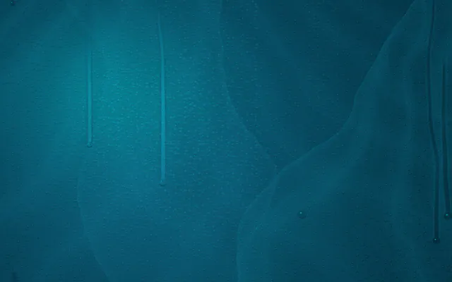
X header 3:1
1500 × 500
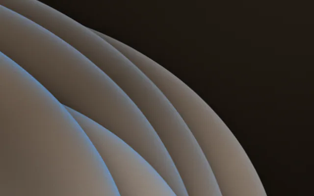
Post 4:5
1080 × 1350
Story 9:16
1080 × 1920
The launch message on an X header…
…and on a feed post. Same words, same look, a layout for each shape.
For the rest of launch week, see product launch graphics and pitch deck design. Gradiently's Studio can lay one finished design out again for each of these sizes with copy to sizes, which keeps a launch set consistent without redrawing it eight times.
When to invest in a full brand
The right moment is when the story stops changing: you know who the product is for, why they stay and how you are different. A few signs you're there.
- Customers describe the product back to you in the same words, without prompting.
- Your positioning has survived a few months without a rewrite.
- You are raising, hiring or entering a market where first impressions carry more weight.
- The scrappy look is now the reason people hesitate, not the product.
When that day comes, you are not starting over. The name, wordmark and background look you locked early become the foundation, and the full identity grows around them. If the early brand really doesn't fit any more, work through a rebrand checklist so nothing gets left behind.
Questions people ask
How much should a startup spend on branding before product-market fit?
Only enough to look credible and consistent: a name you can own, a simple wordmark, a small palette, one or two typefaces and a consistent background look. Save the full identity for later.
Should a startup design a logo symbol early?
Usually not. A well-set wordmark works immediately and survives pivots, while a symbol takes time to earn meaning.
What branding does a startup need for launch?
A website hero, a link preview image, social headers and posts, a story format and slides, all made as one consistent set.
When should a startup rebrand?
When the product, audience or positioning has changed so much that the early brand no longer fits, usually after product-market fit.
What size should a startup's link preview image be?
1200×630 pixels, the Open Graph size used when links are shared in chats and feeds.
Written by Gradiently
The team behind Gradiently, a design tool built around Marks: living gradients that make everything you design look like yours.
See our profile