Tätä opasta ei ole vielä omalla kielelläsi, joten tässä se on englanniksi.
Lyhyesti
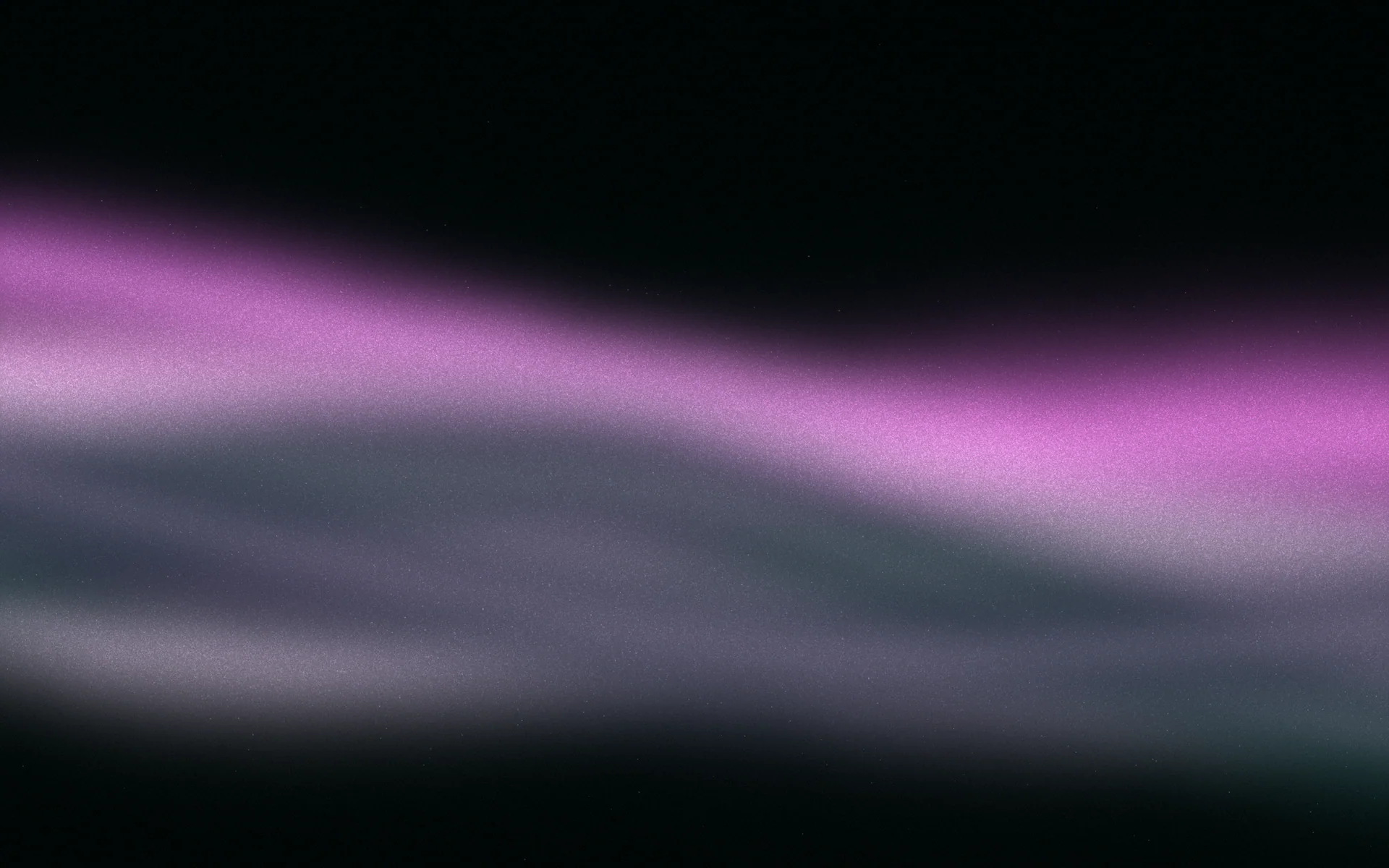
- A purple gradient blends shades of violet, purple, plum or lavender, often with a neighbouring blue or pink.
- Purple is commonly associated with creativity, luxury and imagination, and has become a very common colour in technology branding.
- Deep purples such as #4c1d95 carry white text comfortably, while light lavenders need dark text.
- Mid purples like #a78bfa are the hardest for text, because they are too light for white type and too saturated to feel calm under black.
- Adding warmth, depth or grain is the quickest way to stop a purple gradient looking like a default preset.
Tällä sivulla
A purple gradient blends shades of violet, purple, plum or lavender, often with a neighbouring blue or pink. It is one of the most popular gradient colours for websites, apps and social posts, because purple feels imaginative and a little luxurious, and it glows beautifully on a dark screen. Below are purple gradient palettes grouped by mood, each with copyable CSS, followed by how to put text on them and how to keep them from looking like everyone else's.
The purple family: violet, purple, plum and lavender
"Purple" covers a wide range. Violet leans blue and feels cool and electric. Magenta leans pink and feels warm and loud. Plum is a deep, reddish purple that feels rich; lavender is a pale, greyish purple that feels soft. Knowing which you want makes every other choice easier.
What a purple gradient signals
In much of Europe and the Americas, purple is associated with creativity, imagination and luxury. The luxury link is historical: for centuries purple dye was rare and costly, so it was worn by the powerful. In recent years it has also become one of the most common colours in software and technology branding, where it suggests something inventive without the seriousness of blue. Associations differ elsewhere; colour meanings around the world has details.
- Creative tools and studios: violet and magenta feel inventive and a little playful.
- Beauty and wellness: lavenders and lilacs feel soft and restorative.
- Music, nightlife and gaming: deep purples with a vivid glow feel like evening.
- Premium products: plum and near-black amethyst feel rich, especially with a warm highlight.
The trade-off is familiarity. Because so many tech brands use a violet gradient, yours has to earn its difference through depth, warmth, material or how consistently you use it.
Dark purple gradients
Dark purple gradients feel rich and nocturnal. They work for music, nightlife, premium products and anything that should feel like evening. Keep the darkest stop close to black and let one lit colour rise from it.
Light and pastel purple gradients
Pale purples feel calm, gentle and a little dreamy. They suit wellness, beauty, stationery and anything that should feel soft. They need dark text, and they look best with a hint of warmth or blue so they don't read as flat grey-lilac.
Vivid purple gradients
Vivid purples are the loudest and the most common. Use them for launches, gaming, events and bold brands, and keep them away from long reading. Blending purple towards pink or orange keeps the middle bright; blending towards green goes grey.
Text on purple gradients
Purple is easy to get wrong for text because mid purples sit in an awkward place: too light for white type, too dark and saturated for black to feel calm. Choose the ink by where the text actually sits.
| Text on background | Contrast | Verdict |
|---|---|---|
White on #2e1065 | 15.2:1 | Excellent for any text |
White on #4c1d95 | 11.0:1 | Excellent |
White on #7c3aed | 5.7:1 | Fine for body and large text |
White on #a78bfa | 2.7:1 | Fails, even for large text |
#1e1033 on #a78bfa | 6.6:1 | Dark ink works here |
#1e1033 on #ede9fe | 15.0:1 | Excellent |
On a gradient, check the lightest point behind white text and the darkest point behind dark text. Text on a gradient covers placement, and colour contrast explains the ratios.
Dark and rich: a cover that suits evening listening.
Soft and light: a gentle post with dark ink.
How to keep a purple gradient from looking generic
Violet-to-pink at 135 degrees is one of the most used gradients anywhere. It is attractive, and it no longer says anything about who is using it. Four small changes help.
- Deepen it. Start from near-black purple instead of a mid violet. Depth reads as premium.
- Warm it. Add a peach, apricot or gold highlight at one end. Purple with a warm light feels like dusk rather than software.
- Change the shape. A low radial glow or a vertical fall feels more like light than a diagonal fill. See radial gradients.
- Add a material. Fine grain or a soft sheen turns a flat blend into a surface. See grainy gradients.
.hero {
  background-color: #1a0b2e;
  background-image:
    radial-gradient(circle at 75% 110%, #fdba74 0%, transparent 35%),
    linear-gradient(in oklch 170deg, #0f0a1f 0%, #3b1a6e 55%, #7c3aed 100%);
}If purple is your brand colour, consistency matters more than the exact blend. Gradient branding covers how to make one purple yours. You can also search Gradiently's Market for "deep violet" or "lavender" to see living purple Marks.
Usein kysyttyä
What colours go well with purple in a gradient?
Blue, pink, magenta and warm highlights like peach or gold blend cleanly with purple. Green and yellow sit opposite it and tend to turn grey in the middle of a gradient.
What is the CSS code for a purple gradient?
For example, linear-gradient(160deg, #0f0a1f 0%, #2e1065 55%, #6d28d9 100%) gives a deep amethyst gradient. Every example on this page can be copied directly.
What text colour works on a purple gradient?
White works on deep and mid-dark purples, and a near-black purple ink works on light and mid purples. Check contrast where the gradient is lightest behind white text.
What does a purple gradient signal?
Purple is commonly associated with creativity, imagination and luxury. It is also very common in technology branding, which makes it familiar but harder to stand out with.
Kirjoittanut Gradiently
Gradientlyn tiimi. Gradiently on Markien ympärille rakennettu suunnittelutyökalu: eläviä liukuvärejä, joiden ansiosta kaikki suunnittelemasi näyttää omaltasi.
Katso profiilimme