The short version
- A background texture is fine surface detail, such as grain, paper fibre, woven fabric or frosted glass, layered over a colour or gradient.
- Texture works best at low strength, felt rather than seen, so it adds warmth without competing with the content on top.
- Texture scale should match viewing size: fine grain for small screens and close viewing, coarser texture for large formats seen from further away.
- Laying grain over a gradient hides banding, because random detail breaks up the visible steps between shades.
- Social platforms and video encoders recompress images, which can smear very fine texture, so check the texture after uploading.
On this page
A background texture is fine surface detail laid over a colour or gradient: the speckle of film grain, the fibres of paper, the weave of linen, the frost of glass. It is what makes a background read as a material rather than as pixels. The rule that matters most is strength. A texture you feel rather than notice makes a design warmer and more expensive-looking; a texture you notice first becomes the subject, and fights everything on top of it.
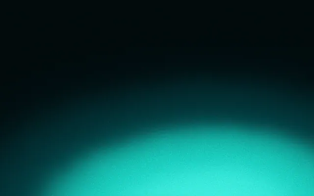
A textured gradient on a portrait post: the surface reads as a material, and the words still lead.
Types of background texture
| Texture | Feels like | Best for |
|---|---|---|
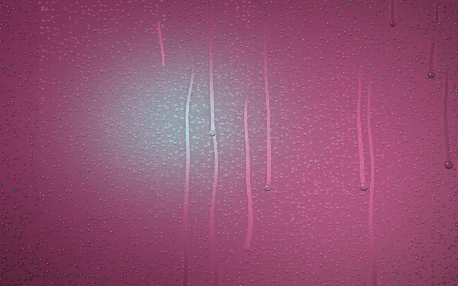
| Grain or noise | Film, print, a matte finish | Gradients, dark backgrounds, anything that bands |
| Paper | Printed, handmade, editorial | Quotes, journals, invitations, calm brands |
| Fabric and linen | Soft, woven, tactile | Fashion, interiors, hospitality |
| Frosted glass | Modern, layered, luminous | Interfaces, cards over colour, tech brands |
| Halftone and riso dots | Retro print, zines, posters | Playful and editorial social posts |
| Stone and concrete | Solid, architectural, quiet | Luxury, architecture, product photography |
Each texture carries an association. Grain says film and print, paper says handmade, glass says interface. Choose the one that fits what your brand should feel like, then use it everywhere; mixing paper on one post and glass on the next undoes the effect. If you have not settled on a feel yet, brand personality has a simple way to decide.
Scale: matching texture to viewing size
Texture reads differently at different sizes. A phone screen held close shows every speck, so fine grain is enough. A poster across a room or a slide on a projector needs coarser texture to register at all. And texture that looks right on a 1080×1350 post can vanish when a platform shrinks it to a thumbnail, or turn into blotches when it is recompressed.
Story 1080×1920: fine
1080 × 1920

Post 1080×1350: fine
1080 × 1350

Slide 1920×1080: medium
1920 × 1080
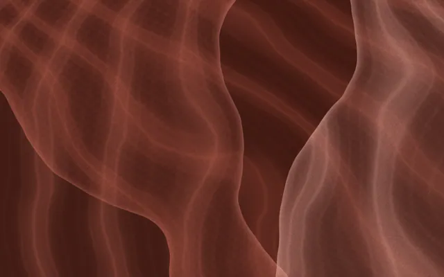
A3 print 3508×4961: coarser
3508 × 4961
In print, grain generally survives well and even helps smooth gradients reproduce cleanly; printing gradients covers the details.
Layering texture over gradients
The most useful pairing is texture over a gradient. Grain breaks up the visible steps that appear in smooth blends, which is called banding, and it makes a digital gradient look printed. The usual method is to place the texture as a separate layer above the colour and blend it in with a mode such as Overlay or Soft light at low opacity, so it shades the colour rather than covering it.
- 1
Start with the colour
Get the gradient right first. Texture will not rescue colours that do not work together.
- 2
Add one texture layer
Place it above the gradient. Use a grey or neutral texture so it does not tint the colour.
- 3
Blend it in
Set the layer to Overlay or Soft light. Soft light is gentler and keeps colours clean.
- 4
Lower the strength
Reduce opacity until you only notice the texture when you look for it, often well under half.
- 5
Check the darkest area
Banding hides in dark, slow fades. Make sure the texture has dissolved any steps there.
On the web the same approach is a few lines of code; see CSS noise texture. For why grain in particular looks so good on gradients, read grainy gradients.
Texture and legibility
Avoid
- Strong texture directly behind small text
- High-contrast patterns such as bold linen weave under body copy
- Two or three different textures in one design
- Texture so fine it turns to mush after upload
Do
- Faint texture, or a calmer area where words sit
- Low-contrast texture in close shades of one colour
- One texture family across every format
- Check the uploaded version, not just the export
Texture adds visual noise near letters, and small type suffers first. Keep texture faint where text sits, or give the words a calm, even region of the background. Text on busy backgrounds covers the techniques in detail.
Texture and colour running straight through the words…
…and the same background making calm room behind them.
Texture that stays consistent
Texture is easy to lose between tools: a grain layer in one file, a paper image in another, a different strength on each export. In Gradiently, texture is part of the background itself. A Mark stacks up to three materials with grain and light, so the same surface renders behind every design at every size, and its calmest region moves behind the words.
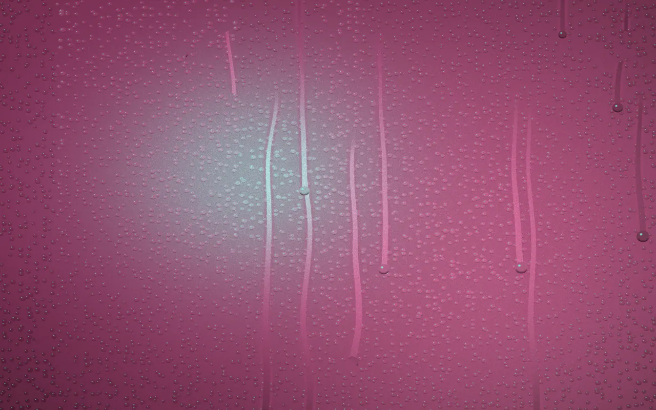
GR·N4D7·V5
Evening Station
See this MarkQuestions people ask
What is a background texture?
Fine surface detail, such as grain, paper fibre, fabric weave or frosted glass, layered over a colour or gradient so it reads as a physical material.
How strong should a background texture be?
Faint. You should notice it only when you look for it. If the texture is the first thing you see, reduce its opacity.
Does adding texture fix gradient banding?
Grain usually does. Random fine detail breaks up the visible steps between shades so the blend looks smooth.
What blend mode should I use for texture?
Soft light for a gentle effect that keeps colours clean, or Overlay for a stronger one. Use a neutral grey texture so it does not tint the colour.
Why does my texture look blotchy on social media?
Platforms recompress uploads, which can smear very fine texture. Use a slightly coarser texture and check the uploaded result.
Written by Gradiently
The team behind Gradiently, a design tool built around Marks: living gradients that make everything you design look like yours.
See our profile