The short version
- Gradient texture is any surface detail laid over a colour blend, such as grain, paper fibre, glass or a silk sheen, that makes it read as a material.
- Each texture family carries its own associations: grain suggests film and print, paper suggests craft, glass suggests technology and silk suggests luxury.
- Texture changes the character of a gradient more than a change of colour does, which is why it is one of the hardest things to copy.
- Textures can be stacked, usually as a structure such as silk or fluting, a surface such as grain or paper, and a light on top.
- Texture should stay out of the way of words: lighter behind text, stronger in open areas.
On this page
Gradient texture is the surface you lay over a colour blend so it reads as a material rather than a screen default: a fine grain like film, the tooth of paper, the clarity and refraction of glass, or the soft folds of silk. The colours say what mood you are in; the texture says what the thing is made of. That is why two gradients with identical colours can feel completely different, and why texture is one of the most distinctive parts of a visual identity.
The four texture families
| Texture | What it looks like | What it says | Suits |
|---|---|---|---|
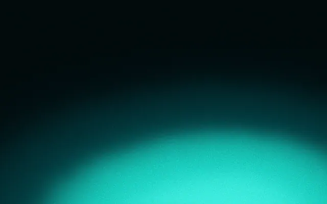
| Grain | Fine random speckle over the colour | Film, print, analogue warmth | Editorial, music, photography, most brands |
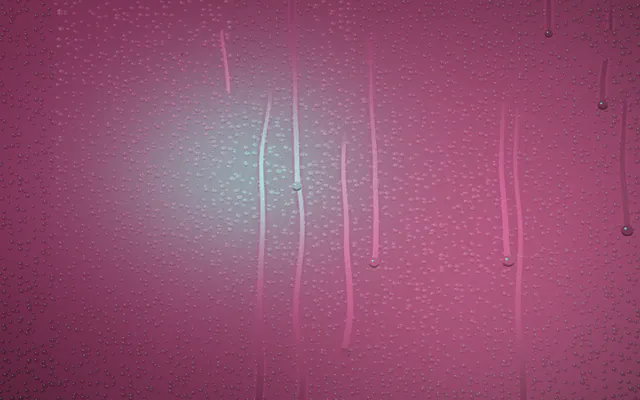
| Paper | Soft fibres and tooth, warm off-white base | Craft, calm, something made by hand | Stationery, food, books, studios |
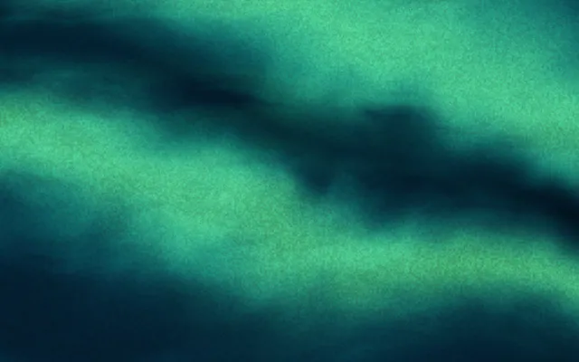
| Glass | Clarity, blur, refraction, crisp highlights | Technology, precision, depth | Apps, software, hardware, finance |
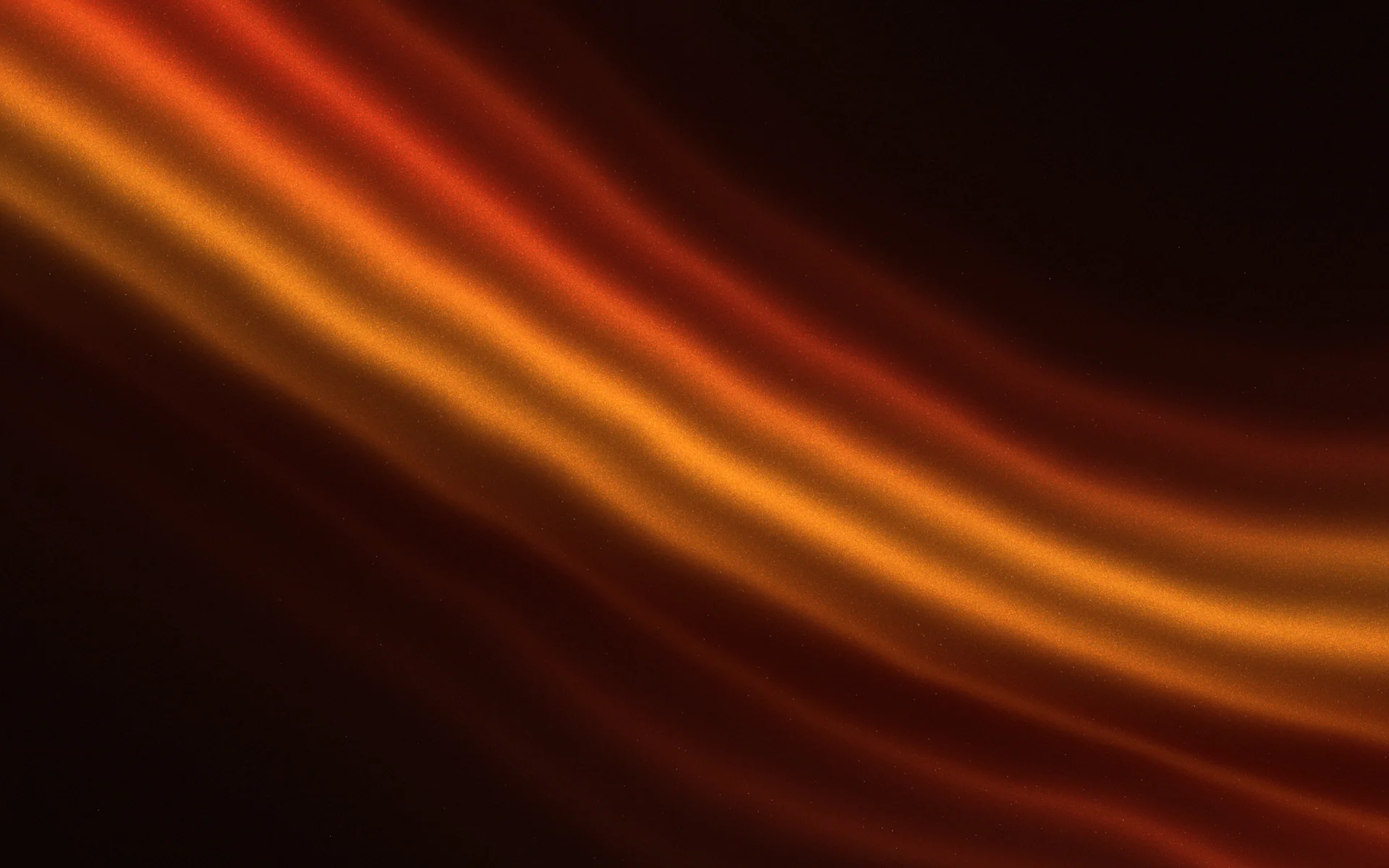
| Silk | Smooth folds with soft moving highlights | Luxury, softness, sensuality | Beauty, fashion, fragrance, jewellery |
Grain: film and print
Grain is the most versatile texture and the easiest to add. A fine layer of monochrome noise makes a blend feel photographed or printed, and it also hides the banding that smooth digital gradients often show. It works with almost any palette, which is why it has become the default finishing touch. How much to use, and how, is in grainy gradients.
Paper: craft and calm
Paper texture brings a warm off-white base, soft fibres and a slight unevenness, as if the gradient had been printed or painted. It pairs naturally with pale colours, muted inks and serif type. Keep the colour blooms small and let the paper show; a pastel or earthy gradient on paper feels handmade in a way a pure white ground never does. See pastel gradients for palettes that suit it.
Glass: technology and depth
Glass textures come in two kinds. Frosted glass blurs whatever is behind it, which is the basis of glassmorphism. Clear or fluted glass refracts the colour into bands and adds crisp highlights where light catches an edge. Both suggest precision and modern hardware. The key is the highlight: a thin, bright line placed where the light would hit, and darker colour everywhere else.
Silk: luxury and softness
Silk and satin look like smooth folds of fabric: broad soft shadows, and narrow bright highlights where the cloth turns towards the light. On screen, that means a gradient with sharp light bands between deeper tones, often in a single hue. Deep jewel colours, such as wine, emerald and midnight, read as evening wear; pale ones, such as champagne and blush, read as bridal or skincare. Silk works beautifully in slow motion, where the highlights can drift.
How to stack textures
Real materials combine textures: silk has a sheen and a weave, printed paper has fibres and ink grain. Gradients can do the same, as long as each layer has a clear job. A reliable order is colour, then structure, then surface, then light.
- 1
Colour field
The blend itself: your gradient, mesh or glow. Get this right first; texture can't fix a muddy palette.
- 2
Structure
The large-scale form of the material: silk folds, glass flutes, the soft unevenness of paper. It changes how the colour flows.
- 3
Surface
The fine detail: grain or paper tooth. It sits over everything and makes the surface feel physical.
- 4
Light
Highlights and shadows that tell the eye where the light comes from. A single consistent light source makes all the layers read as one object.
.silk {
  position: relative;
  isolation: isolate;
  /* colour and structure: satin folds in one hue */
  background: linear-gradient(115deg, #5b1733 0%, #9d2a55 22%, #e8a3b8 30%, #9d2a55 40%, #4a0f28 60%, #b8456f 72%, #5b1733 100%);
}

.silk::after {
  /* surface: fine monochrome grain */
  content: "";
  position: absolute;
  inset: 0;
  z-index: -1;
  background-image: url("data:image/svg+xml,%3Csvg xmlns='http://www.w3.org/2000/svg' width='200' height='200'%3E%3Cfilter id='g'%3E%3CfeTurbulence type='fractalNoise' baseFrequency='0.9' numOctaves='2' stitchTiles='stitch'/%3E%3CfeColorMatrix type='saturate' values='0'/%3E%3C/filter%3E%3Crect width='100%25' height='100%25' filter='url(%23g)'/%3E%3C/svg%3E");
  mix-blend-mode: soft-light;
  opacity: 0.25;
}Texture and legibility
Texture adds detail, and detail behind small letters makes them harder to read. Keep texture lighter behind text and stronger in open areas, and keep type and logos above every texture layer so their edges stay crisp. Strong silk highlights and glass reflections are the biggest risk, because they create bright lines that can slice through a word. See type on busy backgrounds.
Texture at full strength behind the words: the surface competes with the sentence.
The same material relaxing behind the words: texture where there is space, calm where there is text.
Texture as identity
Colours can be sampled from a screenshot in seconds. A texture, and the way it behaves with light and motion, is much harder to reproduce. That makes texture one of the strongest ways to make a gradient your own. Every Mark in Gradiently stacks up to three materials over its colours, with its own light and grain, and the Forge lets you choose them control by control.
GR·75X1·NM
February Quay
See this MarkQuestions people ask
What is gradient texture?
Gradient texture is surface detail laid over a colour blend, such as grain, paper, glass or silk, so the gradient reads as a material.
Which texture should I use on a gradient?
Match the texture to what your brand would be made of: grain for film and print, paper for craft, glass for technology, silk for luxury.
How do I add texture to a gradient in CSS?
Layer a noise or pattern image over the gradient with a blend mode such as Soft Light or Overlay, at a low opacity.
Can you combine textures on one gradient?
Yes. Stack them by job: colour field, then structure such as silk folds, then surface such as grain, then light.
Does texture make text harder to read?
It can. Keep texture lighter behind words and keep text above all texture layers.
Written by Gradiently
The team behind Gradiently, a design tool built around Marks: living gradients that make everything you design look like yours.
See our profile