The short version
- A gradient is a gradual transition from one colour to another across a surface, instead of a single flat colour.
- Every gradient is defined by its colour stops, the positions of those stops, a shape or direction, and the colour space used to blend between them.
- The main types are linear, radial, conic and mesh, and each one moves colour through space in a different way.
- Gradients came back into fashion on screens because they suggest light, depth and movement in a way flat colour can't.
- Most gradient problems, such as stripes and grey middles, come from the blend itself and can be fixed with better stops, a better colour space or a little grain.
On this page
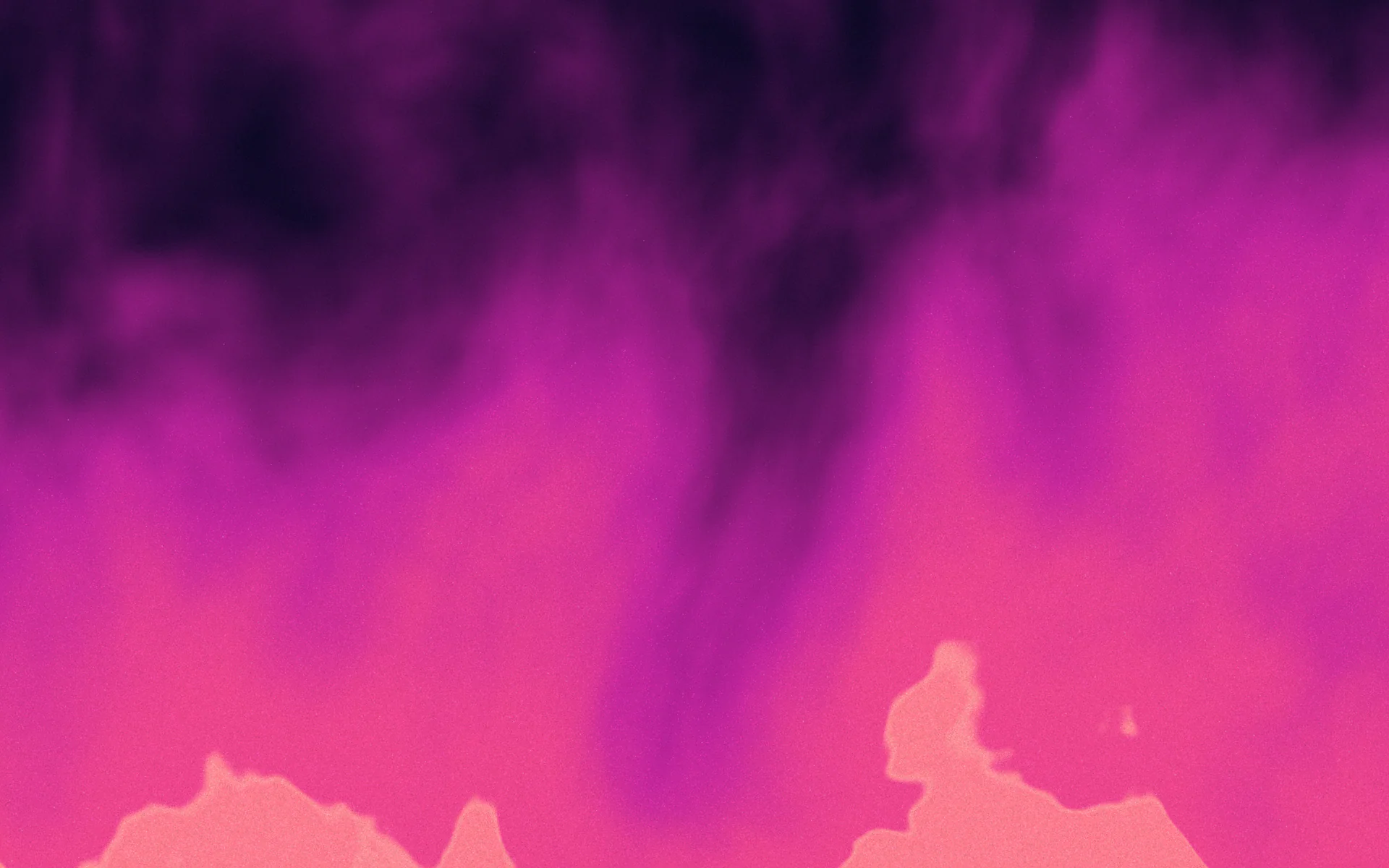
What is a gradient? In design, a gradient is a smooth, gradual change from one colour to another across a surface, such as deep blue melting into violet across a poster. Where a flat fill paints every pixel the same colour, a gradient gives each point its own colour, worked out from a few colours you choose and where you place them. That small change is why a gradient can look like light, air or depth, and why it is also easy to make look cheap.
This page covers the parts every gradient is made of, the main kinds, where gradients are used and why they returned. Each section links to a deeper guide when you want the detail.
The parts of a gradient
Every gradient, whether it is drawn in a design tool, written in CSS or rendered by a game engine, comes down to the same few ingredients. Once you can name them, you can describe any gradient precisely enough for someone else to rebuild it.
| Part | What it means | Example |
|---|---|---|
| Colour stops | The colours the gradient passes through | #1e1b4b, #7c3aed, #f472b6 |
| Stop positions | Where each colour sits, from 0% to 100% | Violet at 55% instead of 50% |
| Shape or direction | The path colour travels along | 135 degrees, or a circle from the centre |
| Interpolation | The colour space used to blend between stops | sRGB, OKLab or OKLCH |
| Texture | Anything laid over the blend | Grain, paper tooth, a sheen |
linear-gradient(135deg, #1e1b4b 0%, #7c3aed 55%, #f472b6 100%)Stop positions matter as much as colours. Move the middle stop from 50% to 65% and the same three colours tell a different story: more shadow, a later sunrise. If you want to understand direction in detail, read which way a gradient should go.
Smooth and stepped gradients
A smooth gradient blends continuously between stops. A stepped or hard-stop gradient places two stops at the same position, so colour jumps instead of blending. Hard stops make stripes, flags, progress bars and retro sunsets; they are still gradients, just with the blending turned off at those points.
Smooth gradients have one weakness: screens show a limited number of shades, so a very gentle blend can break into visible stripes. That problem has its own guide, gradient banding.
The main types of gradient
The type is the shape colour travels along. Four types cover almost everything you will meet, and types of gradients shows each one with live code.
- Linear: colour changes along a straight line at an angle. The workhorse for backgrounds, buttons and banners. See CSS linear gradients.
- Radial: colour spreads outwards from a point in a circle or ellipse, like a spotlight or a glow. See radial gradients.
- Conic: colour sweeps around a centre point, like the hand of a clock. Good for colour wheels, pie charts and sheen. See conic gradients.
- Mesh: several points of colour blend in two dimensions at once, so the result looks organic and painterly. See mesh gradients.
How colours blend: the part people skip
Between two stops, software has to invent every colour in between. How it does that depends on the colour space. Most tools and older CSS blend in sRGB, which mixes red, green and blue values in straight lines. That is fast, but it can pass through dull greys, especially between opposite colours such as blue and yellow.
Newer colour spaces such as OKLab and OKLCH are built around how people perceive lightness and hue, so blends stay brighter and more even. In CSS you can ask for them directly, and the difference is easy to see. The full story, and the fixes, are in muddy gradients.
.sky {
  /* default: blended in sRGB, passes through grey */
  background: linear-gradient(90deg, #0000ff, #ffff00);
}

.sky-better {
  /* blended in OKLCH, travels round the hue wheel through teal */
  background: linear-gradient(90deg in oklch, #0000ff, #ffff00);
}Where gradients are used
Gradients earn their place wherever a surface needs to feel lit or alive without adding a photo. The most common jobs are backgrounds for social posts and websites, app icons, buttons and highlights in interfaces, packaging, posters, and brand identities that use a blend the way other brands use one colour. For the identity side, see gradient branding.
As a background, a gradient carries the mood so the words can stay short.
As an identity, the same gradient on a slide keeps every format recognisable.
Why gradients came back
Gradients were everywhere in the glossy interfaces of the 2000s, then fell out of favour when flat design took over screens in the early 2010s. They returned in a quieter form: fewer bevels and fake reflections, more soft blends of two or three colours. High-resolution displays helped, because smooth colour looks better on dense screens, and brands looking for something more distinctive than one flat hue found room in blends. The long view is in the history of gradients.
Today the most interesting gradients go beyond colour. Grain, texture and slow motion make a blend feel like a material rather than a preset, which is the subject of grainy gradients and gradient texture.
A gradient that looks generic
- Two colours straight from a preset
- Blended in sRGB with a grey middle
- Perfectly clean, so it bands on dark screens
- Stretched or cropped to every format
A gradient that looks considered
- Three to five related colours with one accent
- Blended in OKLCH or with a chosen middle stop
- A little grain to hide stripes and add tactility
- Rendered fresh for each size
If you would rather start from a finished blend than build one from scratch, the Market has thousands of Marks: complete gradient recipes with colour, material, grain and light that you can design with for free.
Questions people ask
What is a gradient in simple words?
A gradient is a gradual change from one colour to another across a surface, so each point shows a slightly different colour instead of one flat fill.
What are colour stops in a gradient?
Colour stops are the colours a gradient passes through, each placed at a position between 0% and 100%. The software blends every colour in between.
What are the main types of gradient?
The main types are linear, radial, conic and mesh. Linear follows a straight line, radial spreads from a point, conic sweeps around a centre and mesh blends several points in two dimensions.
Why does my gradient look grey in the middle?
Blending opposite colours in the sRGB colour space passes through grey. Add a chosen middle stop, use closer hues, or blend in OKLCH.
Why does my gradient have stripes?
Screens show a limited number of shades per channel, so subtle blends step visibly. Adding a little grain or noise and avoiding heavy compression hides the steps.
Written by Gradiently
The team behind Gradiently, a design tool built around Marks: living gradients that make everything you design look like yours.
See our profile